Here are 20 essential terms every beginner should know when starting with HTML & CSS, explained clearly in English.
Learning these terms will help you read documentation, follow tutorials, and build your own web pages with more confidence!
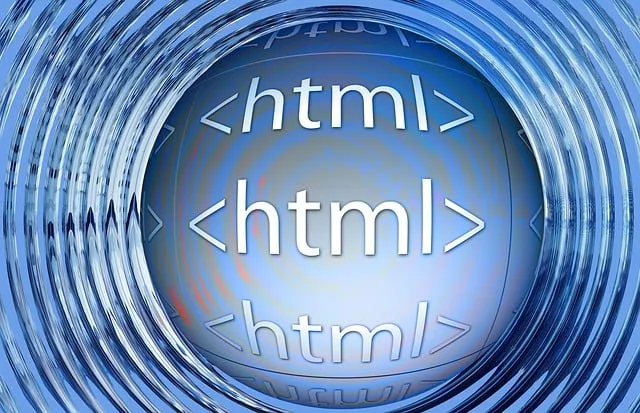
1. HTML (HyperText Markup Language)
“HTML is the backbone of the web.”
HTML structures and organizes the content on a webpage. It uses tags to define headings, paragraphs, images, and more.
2. CSS (Cascading Style Sheets)
“CSS adds style to your content.”
CSS controls how HTML elements look – like colors, fonts, spacing, and layout – making your website visually appealing.
3. Tag
“Tags define the structure of HTML.”
A tag is a keyword wrapped in angle brackets (e.g.,<h1>) that tells the browser how to display content.
4. Element
“An element consists of a start tag, content, and an end tag.”
For example,<p>Hello</p>is a paragraph element, with a start tag<p>, contentHello, and end tag</p>.
5. Attribute
“Attributes provide additional information about elements.”
Attributes appear inside the start tag to define properties, likehrefin<a href="url">.
6. Selector
“Selectors target HTML elements in CSS.”
Selectors tell CSS which elements to style. For instance,p { color: blue; }targets all<p>elements.
7. Class
“Use classes to apply the same style to multiple elements.”
Classes are reusable identifiers, defined withclass="name", used like.namein CSS.
8. ID
“IDs should be unique within a page.”
Each ID, written asid="header", should appear only once. In CSS, it’s targeted with#header.
9. Div
“A <div> is used to group content together.”
A generic container often used to build page layouts.
10. Span
“Use <span> to style inline text.”
Unlike<div>,<span>doesn’t break lines and is useful for styling parts of a sentence.
11. Margin
“Margin is the space outside an element’s border.”
It creates space between the element and its neighbors.
12. Padding
“Padding is the space inside an element’s border.”
It adds space between the content and the border of the element.
13. Border
“Borders surround the padding and content.”
Borders define the visible boundary of an element, often styled with color and thickness.
14. Box Model
“The box model consists of content, padding, border, and margin.”
This concept explains how every HTML element is wrapped and spaced.
15. Responsive Design
“Responsive design adapts to different screen sizes.”
It ensures your site looks good on phones, tablets, and desktops by using flexible layouts.
16. Flexbox
“Flexbox helps align items easily.”
A CSS layout mode that simplifies positioning and distributing space among items in a container.
17. Grid
“Grid allows complex layouts with rows and columns.”
A powerful system to create 2D layouts with precise control over alignment and spacing.
18. Media Query
“Media queries apply styles based on device conditions.”
They let you change styles depending on screen size or device type:
cssコピーする編集する@media (max-width: 600px) { body { font-size: 14px; } }
19. Link
“The <a> tag creates a hyperlink.”
Allows users to navigate between pages or sites. Example:<a href="https://example.com">Visit</a>.
20. Color Code
“Colors can be defined by hex codes like #FF5733.”
You can also use RGB or color names likeredorblue.